If you want to improve your data analysis, one tool you can use is a histogram. A histogram is a graphical representation of data that shows how often each value occurs. It can be used to find patterns in data and to see if there are any outliers. Keep reading to learn how to use a histogram to improve your data analysis.
What is a histogram?
A histogram graph is a visualization of the distribution of data. It is created by dividing the range of values in a data set into bins and then counting how many data points fall into each bin. The resulting graph shows how many data points are in each bin and how the distribution of data changes as you move from one bin to the next.
Histograms can be used to improve your data analysis by helping you to understand your data better. For example, if you are trying to decide whether or not to reject a hypothesis, a histogram can help you to determine whether the distribution of your data is consistent with what you would expect if the hypothesis were true.
How do you interpret a histogram?
A histogram is a graph that shows how often data falls within certain ranges. There are three different parts of a histogram: the x-axis, the y-axis, and the bars. The x-axis is the horizontal line that goes across the middle of the histogram and represents the different values in your data set. The y-axis is the vertical line that goes up and down and represents how many data points fall into each range. The bars are the lines that go from the bottom of the y-axis to the top of the x-axis and represent how often data falls into each range.
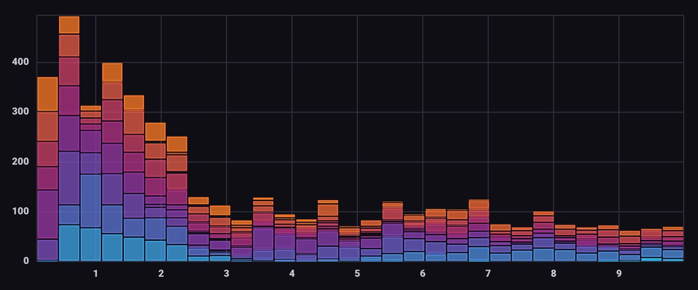
A histogram is an illustration of the distribution of data. It is a graph of the frequency of occurrence of data values, typically displayed as bars. The height of the bar corresponds to the frequency of the data value. A histogram can be used to determine the shape of a distribution, the center, and the spread of the data.
To read a histogram, you should first determine the shape of the distribution. The shape can be determined by looking at the bars and noting how they are distributed. There are five common shapes when it comes to histograms. A symmetric shape is when the bars on both sides of the center are approximately the same height. If the shape is skewed left, the bars on the left side are taller than the bars on the right side. If the graph is skewed right, the bars on the right side are taller than the bars on the left side. A uniform shape is when the bars are all approximately the same height. Finally, in a negatively skewed graph, the bars on the left side are shorter than the bars on the right side.
Once you have determined the shape of the distribution, you can then determine the center and the spread of the data. The center is determined by finding the median, which is the middle value in the data set. The spread is determined by finding the standard deviation, which is a measure of how dispersed the data is around the center.
What are the different types of histograms?
Histograms are used to visualize data and analyze the distribution of data. There are three types of histograms: frequency, relative frequency, and cumulative frequency. Frequency histograms show the number of data points in each interval or bin. This type of histogram is useful for comparing two distributions or for finding the outliers in a distribution.
Additionally, relative frequency histograms show the percentage of data points in each interval or bin. This type of histogram is useful for identifying clusters and gaps in distribution. Finally, cumulative frequency histograms show the total number of data points in each interval or bin. This type of histogram is useful for identifying patterns in distribution over time.
How are histograms useful?

Histograms are a powerful data visualization tool that can help highlight certain insights about information and performance. They are used to show the distribution of data. This can be helpful in business because it can show how data is spread out. This can help businesses make better decisions because they can see how likely something is to happen.
Histograms can also be helpful when businesses are trying to figure out things like the average of a certain set of data or the median of a certain set of data. This type of information can help businesses make better decisions when it comes to things like inventory or what products to produce. Another use for histograms in business is to figure out the standard deviation of data. This is beneficial because it can show how much variation there is in a set of data. Learning this can be helpful when businesses are trying to figure out things like how likely it is that they will sell out of a product.
Overall, histograms are a very helpful tool for businesses to use when trying to make decisions. They can help businesses figure out everything from the average to the standard deviation of data. This can help businesses make better decisions when it comes to things like production and inventory.
A histogram is an important tool for data analysis because it allows you to visualize the distribution of data and identify potential outliers. When used correctly, it can help you to make better decisions about how to improve performance and operations.