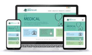
A healthcare website should be aesthetically pleasing and easy to navigate. It is often the first impression that patients have of the health institution, and it is important to project a sense of confidence and professionalism. According to Forrester research, a well-designed website can increase conversions by as much as 200%. Also, a quality user experience will help your site rank higher in Google when Google’s user experience update is released in 2022.
Adding a live chat feature
Adding a live chat feature to healthcare websites can help you connect with your patients and improve customer satisfaction. Compared to email and telephone conversations, web chats allow for more extensive feedback and are often much longer. You can also conduct post-chat surveys to get further insights into your customers’ needs. Adding live chat to healthcare websites also helps you maintain a positive reputation online, which is crucial because 70 percent of people consider online reviews when choosing a healthcare provider.
Live chat is useful for physicians with busy schedules who can’t spend all day answering questions and interacting with patients. Moreover, it is possible to outsource live chat services to a professional company, which can handle it effectively. This option is also cost-effective and can be tested out in a trial run before deciding on whether or not it is the right move for your practice.
Using rounded fonts
When creating a healthcare website, it is important to consider the type of medical industry you are in. Some medical specialists and surgeons will favor a more standardized typeface, while others will use a font that is more casual and playful. You should also take into account the type of target market you are trying to appeal to. For example, if your business is primarily concerned with providing medical services, you should avoid using neon green as this is jarring to the eye, and it doesn’t fit with the image of professionalism that you’re trying to portray. Also, avoid using brown, because it lacks sophistication. The font style must convey reliability and professionalism, while also being readable.
If you’re looking for a modern font, try one of the rounded fonts available. These are often suited to healthcare websites. Montreux Sans Pro is one such font. It is a contemporary Grotesk superfamily that offers fantastic value for money. Polate Soft, another font, is a more casual typeface that features rounded terminals and corners. These types of fonts are also great for branding assignments and are highly versatile.
Including contact information
A healthcare website design should include contact information, preferably prominently displayed on the homepage. The site should also include a list of services and specialties. You can even include a GoogleMaps widget to let people know where you are located. A Services page should be easy to navigate.
Healthcare websites should also include billing and insurance information. This is because healthcare customers expect to see this information when they are searching for medical services. You should also have an online payment portal available for your customers. You can also add a dedicated billing portal page in your website’s main navigation menu.
Using a comfortable color scheme
Color schemes can be a useful way to make a healthcare website design more inviting to patients. Colors can convey a wide range of emotions, from calm to excited, and the right color scheme can be the difference between a good experience and a bad one. Some healthcare websites stick to a traditional color palette, while others experiment with more daring color combinations. A healthcare website should be professional and appealing, but it should also feel comfortable to visitors.
White is a color that can make a healthcare website look sterile, but a lighter shade of white can create a warmer mood. The website of The New School uses a simple yet elegant color scheme and focuses on a series of thought-provoking quotes. You could use the same concept for your website. The New School also uses a lot of white and a font that is easily distinguishable.